


.png)
.png)


What is an Ethereum Liquidation Heatmap?
An Ethereum liquidation heatmap displays the estimated price levels where leveraged ETH positions will be force-closed by exchanges. When traders open longs or shorts on ETH perpetual futures, the exchange records a liquidation price for each. If ETH reaches that level, the position closes automatically and the collateral covers the deficit.
The heatmap aggregates these levels across thousands of positions on Binance and Bybit and plots them as a colour overlay on the ETH/USDT chart. Bright clusters in yellow and green mark dense leverage. Darker zones mark thin areas with little exposure.
The output is a visual map of forced buying and selling pressure, used to anticipate where ETH gets pulled by liquidation flow.
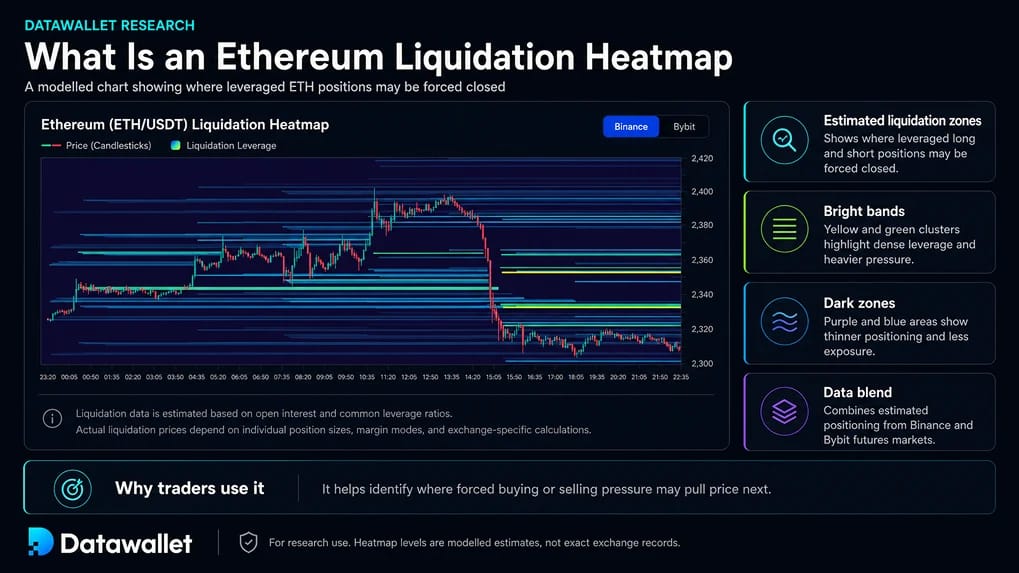
How to Read the ETH Heatmap
Two layers sit on the same chart. The price candle overlay tracks ETH/USDT spot price across the selected timeframe (24H to 1M). The liquidation layer is a colour gradient where intensity reflects estimated leverage that would liquidate at each price level.
Bright bands cluster around $100 increments above $1,000 and $500 increments above $3,000, the price points where ETH traders most commonly set entries and stops. These produce the dense pools the market repeatedly revisits.
Distinct horizontal streaks rather than smooth gradients indicate leverage opened during specific price events. Streaks persist until price reaches them or positions close manually.
.webp)
What Makes Ethereum Liquidations Distinct
Ethereum's liquidation profile differs from Bitcoin's in ways that show up directly on the heatmap:
- Higher leverage density: ETH attracts a more retail-heavy and speculative trader base than BTC, with average leverage running closer to 25x to 50x on retail venues. Clusters appear thicker relative to open interest, which makes ETH cascades faster and more violent on a percentage basis even when absolute dollar size is smaller than BTC.
- Tighter round number gravity: ETH gravitates toward $100 increments above $1,000 and $500 increments above $3,000. The smaller absolute price means clusters form closer together, so a thick band within 2 to 3 percent of spot tends to close the gap before reversing.
- Liquid staking token collateral risk: A meaningful share of ETH perpetual collateral sits in wstETH, stETH, and similar liquid staking tokens. During severe stress these tokens can briefly diverge from spot ETH on individual exchanges, triggering premature liquidations on positions where the underlying ETH has not actually reached the marked level. This risk has no Bitcoin equivalent and is not visible on the heatmap directly.
- Amplified BTC correlation in cascades: When Bitcoin breaks a major level, ETH typically follows with larger moves. The ETH heatmap often mirrors BTC structure with greater intensity, which is why ETH overshoots BTC in percentage terms during broad-market cascades.
- Staking ETF flow as a new variable: Spot ETH ETFs that incorporate staking rewards create a structural buyer that competes with leveraged longs for the same allocation. Yield-seeking capital that previously held leveraged ETH has rotated into staking ETFs, leaving speculators as a larger share of remaining perpetual leverage. This is part of why ETH funding spikes have grown more violent as the ETF category has scaled.
Trading Strategies
ETH heatmaps reward traders who pair them with funding rates, BTC structure, and ETH/BTC ratio. The most common ETH setups include:
- Funding flips during squeezes: ETH funding swings more aggressively than BTC. Heavy short liquidations above price with funding turning sharply negative often precedes a violent upside squeeze. Tracking ETH funding rates alongside the heatmap sharpens the read.
- ETH/BTC correlation breaks: When the ETH heatmap shows a cluster with no BTC equivalent, the move is usually ETH-specific, often following protocol upgrades, ETF flow data, or staking yield changes. These setups carry less macro risk and resolve more cleanly than broad-market cascades.
- Wick targets at sub-round numbers: Dense ETH clusters often form just below round numbers like $2,995 or $3,495 rather than directly at the round number itself. Traders setting stops at psychologically obvious levels create magnet zones a few dollars below, where the wick most often terminates.
- Cascade risk above heavy long pools: ETH cascades amplify in percentage terms because of higher leverage density. Entering a long with a heavy long cluster directly below adds tail risk because a flush through it accelerates harder than the equivalent setup on BTC.
Limitations and Risks
The heatmap is a model built from public data, not a record of actual liquidation prices:
- Levels are estimated: Cross-margin traders with large account balances have different liquidation prices than the model assumes.
- Positions are dynamic: A bright cluster can shrink within hours as traders close out or adjust.
- Exchanges differ: Binance and Bybit run different liquidation engines and ADL policies. The heatmap blends data from both into an aggregate.
- Direction is not predicted: The heatmap shows where pressure sits, not which side gives first.
Frequently Asked Questions
Why does Ethereum show denser liquidation clusters than Bitcoin?
ETH carries higher average leverage than BTC across retail-heavy exchanges. Smaller account sizes and a more speculative trader base produce thicker liquidation pools relative to open interest, which is why ETH cascades resolve more violently in percentage terms.
How do staking ETFs affect ETH liquidation patterns?
Staking ETFs create sustained spot demand and remove ETH from circulating supply through validator deposits. This pulls funding rates positive on perpetuals and builds short clusters above price, which then become squeeze fuel during rallies.
Does the heatmap account for liquid staking token collateral?
No. The heatmap models ETH collateral at face value, but positions collateralised with wstETH, stETH, or similar tokens face additional liquidation risk during stress events when those tokens briefly diverge from spot ETH on individual exchanges.
Can the heatmap predict where ETH will move next?
No. It maps where forced buying and selling pressure sits, not which direction ETH chooses. Direction depends on macro flow, BTC correlation, funding, and order book dynamics outside the heatmap.
Which timeframe is best for trading ETH?
Short-term scalpers use 24H or 48H. Swing traders use 1W or 2W. The 1M view shows longer-term clusters that have persisted across multiple cycles.
Is the Ethereum liquidation heatmap free?
Yes. The ETH liquidation heatmap on Datawallet is free to use and refreshes throughout the day at no cost.